Data that Speaks: how UX Turns What We See into Clear Business Decisions
No doubt, data is everything, but do we truly understand it?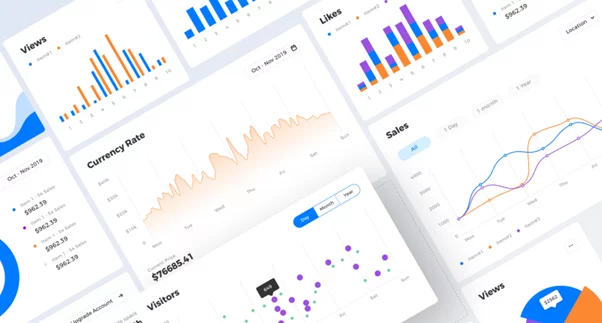
Today’s business is flooded with data. Logistics, finance, management — numbers come pouring in from every possible source. On paper, this should mean smarter decisions, deeper insights, and better outcomes. According to Statista, in 2023, about 120 zettabytes of data were created worldwide, and this is expected to grow to 181 zettabytes by the end of 2025. 2023 witnessed an increase of 23.71% in the data generated compared to the previous year. Yet, there’s a glaring issue: how do we understand it all? Raw numbers, tables, and graphs can often feel like a foreign language, especially if they’re not presented with clarity and purpose.
Imagine being a logistics manager tasked with understanding why deliveries are consistently late. You pore over spreadsheets for hours, but patterns remain hidden, and solutions feel out of reach. Or think of a financial analyst trying to uncover why expenses are steadily increasing. Despite having the data, they struggle to extract meaningful insights. The frustration is real.
Today, we’ll explore how UX decisions, color choices, and visual elements like graphs and charts play a crucial role in helping us, as consumers of business content, process information more easily. These tools are not just about aesthetics — they help filter out the noise, highlight the most important, and make us draw the right conclusions. You’ll discover how they can empower us to make better and faster decisions.
How UX saves data from chaos
Complex data can easily overwhelm users, leading to confusion instead of actionable insights. This is where UX designers step in, equipped with the tools and principles (usability, heuristics, color theory, etc) needed to organize information in ways that make it not only digestible but impactful.
Rule #1: Focus on key insights, not everything
Overloading users with massive amounts of data is counterproductive. Instead, UX design prioritizes the most critical metrics, delivering a clear snapshot of the situation. For instance:
- "95% of deliveries completed on time"
- "5 delays reported this month."
- "Revenue increased by 12%"
Think of these highlights as news headlines that capture the essence of the data. They give you a quick overview, with the option to explore further.
Imagine you open a book, but instead of diving straight into the content, you first get a concise summary. This summary helps you decide whether you want to explore each chapter. UX design works the same way — it offers clarity first and then provides optional details.
Why simplicity matters in data presentation
Complex data isn’t inherently useful. For example, a logistics manager doesn’t need to know the full history of every delivery at a glance. Instead, they need quick, actionable insights — such as identifying problem routes or delays. UX design removes extra complexity, helping users to concentrate on what is essential.
Think of trying to find your gate at an airport. Imagine the chaos if every flight detail for the entire day was crammed onto a single board. Instead, flight boards prioritize your flight, your gate, and your time, making navigation effortless.
Visualizing data: graphs that speak louder than numbers
Numbers are powerful, but they’re often hard to interpret without a visual aid. Graphs translate data into a language that’s easier to understand. However, not all graphs are created equal — choosing the right type is crucial to conveying your message effectively.
The right graph for the right story
- Line charts. Ideal for illustrating trends over time. For instance, "Company revenue grew by 20% over the past year."
- Bar charts. Great for comparisons, like "Region A delivered 15% more on-time orders than Region B."
- Pie charts. Perfect for showcasing proportions, such as "60% of the logistics budget is spent on transportation costs.
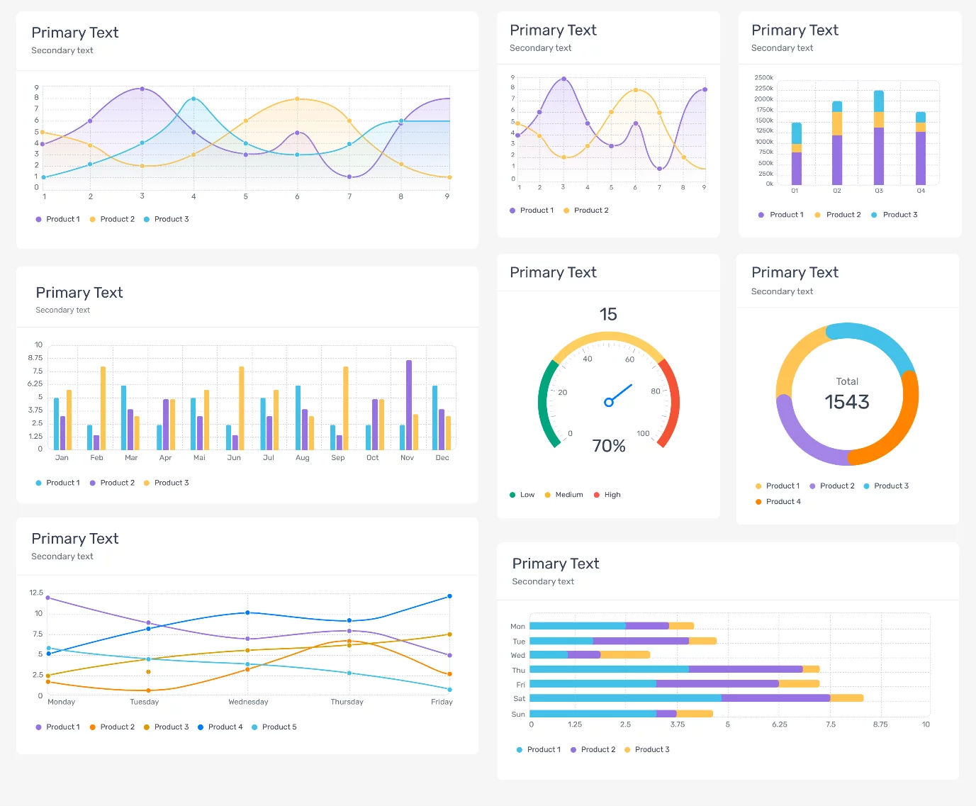
For example, a logistics dashboard could feature a line chart tracking delivery delays over a quarter. At a glance, managers can see when performance dipped and begin exploring the reasons why.
What to avoid in visualizations
Poorly designed graphs can obscure rather than reveal insights. For example, overcrowded pie charts or bar graphs with too many categories make it harder to focus on key points.
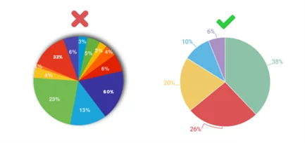
Pro tip: always ensure your graphs are simple, relevant, and tailored to the data’s purpose.
Color: The unspoken language of emotion and action
Color is one of the most powerful tools in UX design, capable of guiding users’ attention and evoking instant emotional responses. However, the key lies in using color thoughtfully and strategically.
How colors communicate meaning
- Green. Signals that everything is going as planned.
- Red. Indicates a problem that requires immediate attention.
- Yellow. Warns of areas that need monitoring or could become problematic.
- Blue. Represents trust, stability, and calmness, often used to show important but non-urgent information.
- Orange. Highlights action, energy, or urgency, commonly used for call-to-action or warnings without high risk.
- Purple. Suggests creativity, innovation, or uniqueness, often used to emphasize forward-thinking ideas.
- White. Represents clarity, simplicity, or neutrality, used to create space or focus attention elsewhere.
- Gray. Indicates neutrality, balance, or areas with no immediate action required.
Imagine a financial dashboard where green bars show revenue growth, and red bars highlight expense increases. By using these colors sparingly, users can instantly focus on the areas that matter most.
What to avoid
A "rainbow" effect where every category has its own color. This creates visual clutter and distracts users.

Using colors inconsistently, leads to confusion about what each color represents.
Colors provide clear, universally understood signals — stop, go, and proceed with caution.
Curious about the latest UI/UX trends? Want to know what developers should focus on to build eco-friendly processes and ensure everyone's happy with the final product? Read on the article “Enhancing the Perception of a Digital Product: how UI/UX Design Shapes User Experience and Business Success”
Context: The answer to “why?”
Numbers alone are rarely enough to drive action. To make data truly meaningful, users need a context that explains why a number is significant and what they should do about it.
Adding context to data
Comparisons. Show how metrics have changed over time or relative to other benchmarks.
Annotations. Add short explanations directly to graphs or dashboards to clarify what the numbers mean.
Example:
A graph showing revenue and expenses might include annotations like:
- "Revenue: $120K (+10% compared to last month)"
- "Expenses: $90K (-5% compared to last month)"
This additional context helps users understand trends without the need for guesswork or lengthy analysis.
It’s like watching a sports game with a commentator. The score alone doesn’t tell the whole story — understanding who dominated and when makes all the difference.
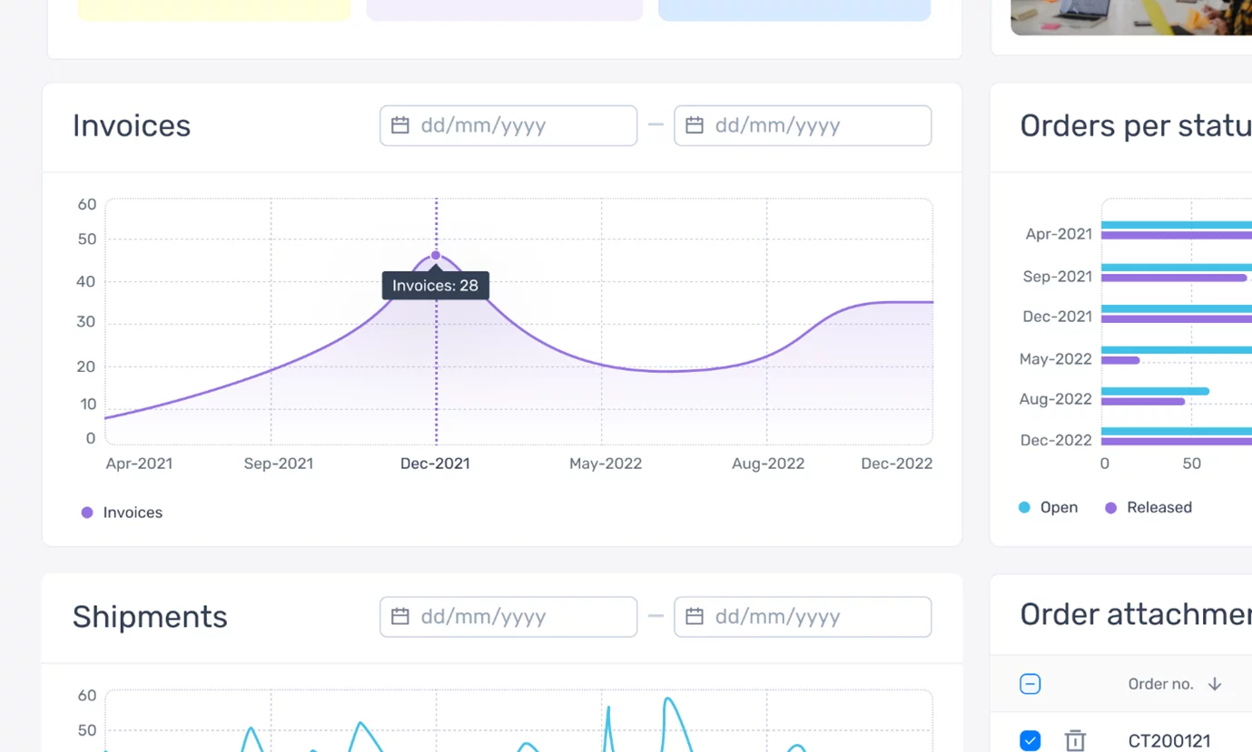
Data for managing customer requests
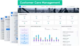
In customer care management, speed and precision are essential. Teams rely on dashboards to track and resolve client issues quickly. A well-designed interface ensures that no request slips through the cracks.
Key features for effective dashboards
- Filters. Allow users to sort requests by status, such as "Resolved," "Pending," or "Needs attention"
- Trends. Graphs displaying metrics like the number of new requests per week and the average resolve time.
Imagine a manager notices that 20% of customer requests have been pending for more than 24 hours. This insight highlights a need to allocate additional resources to maintain resolve times.
Dashboards provide real-time updates, acting as a central hub to help teams make quick and informed decisions, so it's critical and useful.
Data on any device: Flexible, accessible, and always ready
Today, decisions can’t wait until you’re back at your desk. Data must be accessible across devices, whether you’re on a desktop or checking updates from your smartphone.

How UX design adapts to different devices
- Mobile versions. Focus on presenting key metrics, such as "5 unresolved requests" or "95% of deliveries completed on time."
- Desktop versions. Offer more detailed views, including in-depth graphs, comparisons, and advanced analytics.
Think of a pocket-sized notebook — it holds all the essentials for quick reference but allows for further exploration if needed.
Key industries: lessons from finance, logistics, and customer care
Different industries face unique challenges when it comes to data, but smart UX design provides universal solutions.
- Finance. Interactive dashboards power up the spreadsheets, improving the process of tracking income, expenses, and budgets.
- Logistics / Operations. Tools for monitoring delays and optimizing delivery performance help businesses stay efficient.
- Customer care management. Dashboards visualize request statuses and resolve time, ensuring teams can meet service-level expectations.
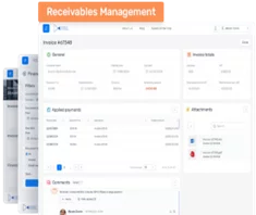
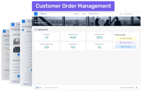
Our product, Xpand Portal combines all these approaches in ready-to-use modules tailored for these industries, making data-driven decision-making more accessible.
Data that works for you
Raw data, no matter how detailed, is just noise without the right presentation. UX design transforms that noise into meaningful insights, empowering users to act with clarity and confidence. The goal isn’t just to display numbers but to tell a story — one that’s easy to understand and actionable.
Data is a story waiting to be told, and as a designer, your role is to help users read and act on that story effortlessly. The right design doesn’t just inform — it drives decisions that matter.
Looking for the right product to help you make data-driven decisions from Microsoft Dynamics 365 Business Central data, in an accessible and user-friendly way? You've come to the right place, book your free demo session: https://www.xpandportal.com/

