What's in store for Xpand Portal: UI/UX updates are on the way!
Yurii Nabochenko, Chief Product Officer of Xpand Ukraine:
In today's dynamic digital landscape, user experience takes center stage. With Xpand Portal, our foremost mission is to empower our customers, to shape their dream swiftly and seamlessly, with a rich array of features at their disposal. However, we recognize that delivering a seamless and intuitive user experience is equally essential. According to Intechnic, improving the customer experience can increase a company's KPIs by more than 80%.
Therefore, we embarked on a transformative journey to review the UI/UX of Xpand Portal, driven by customer’s insights and needs.
Our vision and aspirations
The foundation of our redesign efforts was built upon three fundamental goals:
- Enhance visual appeal: We understand that aesthetics profoundly influences your engagement. Our fresh design aims to captivate users with a visually pleasing interface that is easy on the eyes.
- Optimize user experience: We are committed to making the portal more user-friendly. This means simplifying navigation, reducing complexity, and ensuring that users can effortlessly access the portal's features.
- Increase customers engagement: Engaging our customers and keeping them actively involved is pivotal. The new design will encourage users to interact more with the portal, fostering a sense of community and collaboration.
Top five guiding principles
In crafting the updated UI/UX for Xpand Portal, we centered our vision around five core pillars:
- User-centric approach: Every decision in our design process is driven by user feedback and needs. We're dedicated to creating an experience that resonates with our users' preferences and expectations.
- Seamless user journey: Our aim is to create a journey within the portal that feels natural and intuitive. We want users to feel as though they are moving through the portal effortlessly, without hiccups or confusion.
- Minimalist and aesthetic design: We have embraced a minimalist approach, prioritizing clarity and simplicity. The new design will be visually pleasing, with an uncluttered and elegant appearance.
- Modern and functional layout: Staying current with design trends and technology is essential. Our layouts will be modern and functional, ensuring that users have access to the latest tools and features.
- Usability at the core: User-friendliness is at the heart of our redesign. We want users to effortlessly accomplish their tasks and feel at ease while doing so.
A refreshing color palette
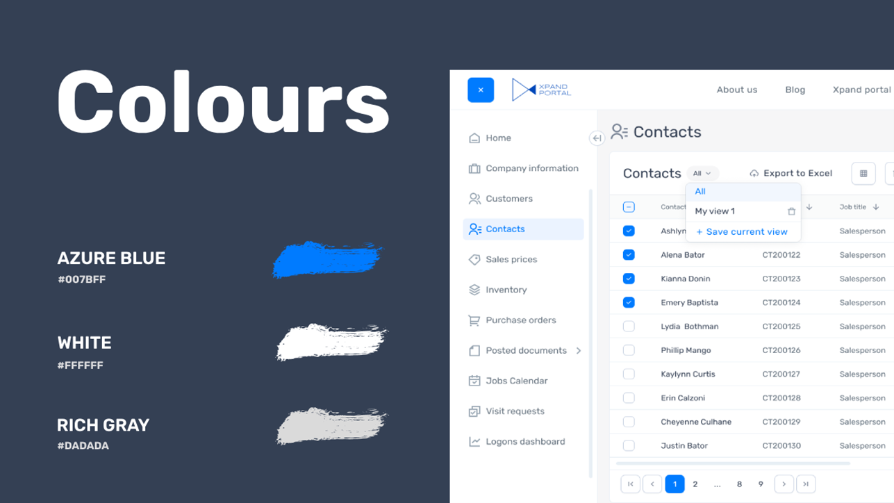
To create a harmonious visual experience, we have meticulously designed a basic color scheme for Xpand Portal. This palette draws from calming and achromatic colors that imbue a sense of serenity and lightness. These colors enhance the portal's visual allure and contribute to a more enjoyable user experience.
What lies ahead
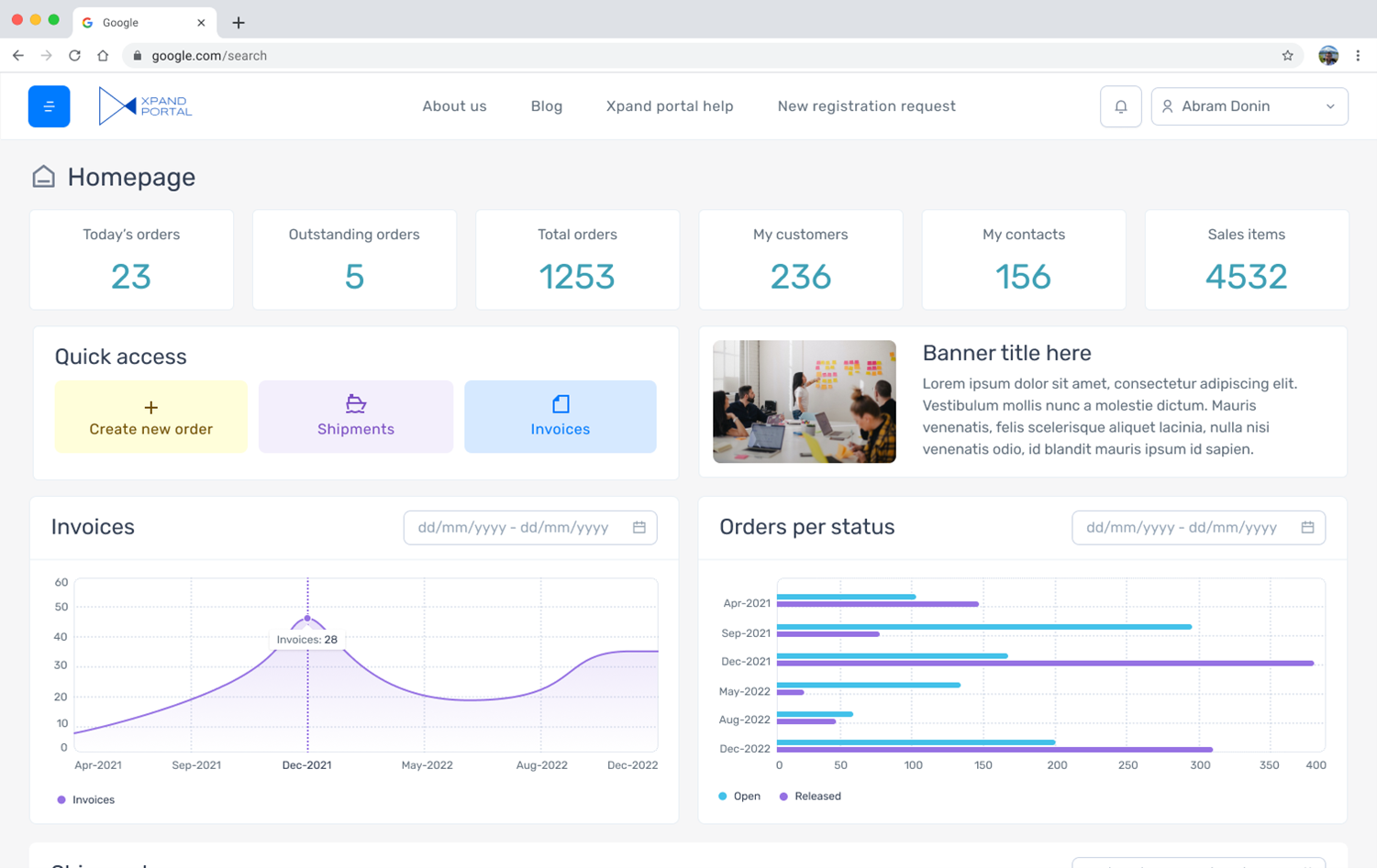
While we cannot unravel everything just yet, we are thrilled to share a couple of screenshots that showcase the renewed UI/UX design. Stay tuned for the coming enhancements that will redefine youre xperience with Xpand Portal.


If you need more information about Xpand Portal solution, please contact us or me directly via LinkedIn. Our team and I will be happy to assist you with your web portal project.
About Xpand Portal
Xpand Portal is a web-based solution with over 6 years of market presence that provides a comprehensive and customizable product for businesses looking to streamline access to their various data sources, such as ERP and CRM systems, and improve companies’ overall productivity. It is designed to be simple and easy to use, with quick and intuitive configuration to meet your specific needs. For detailed information about Xpand Portal, refer to our help center: https://help.xpandsoftware.com/

